Carbon
What Carbon Actually Looks Like
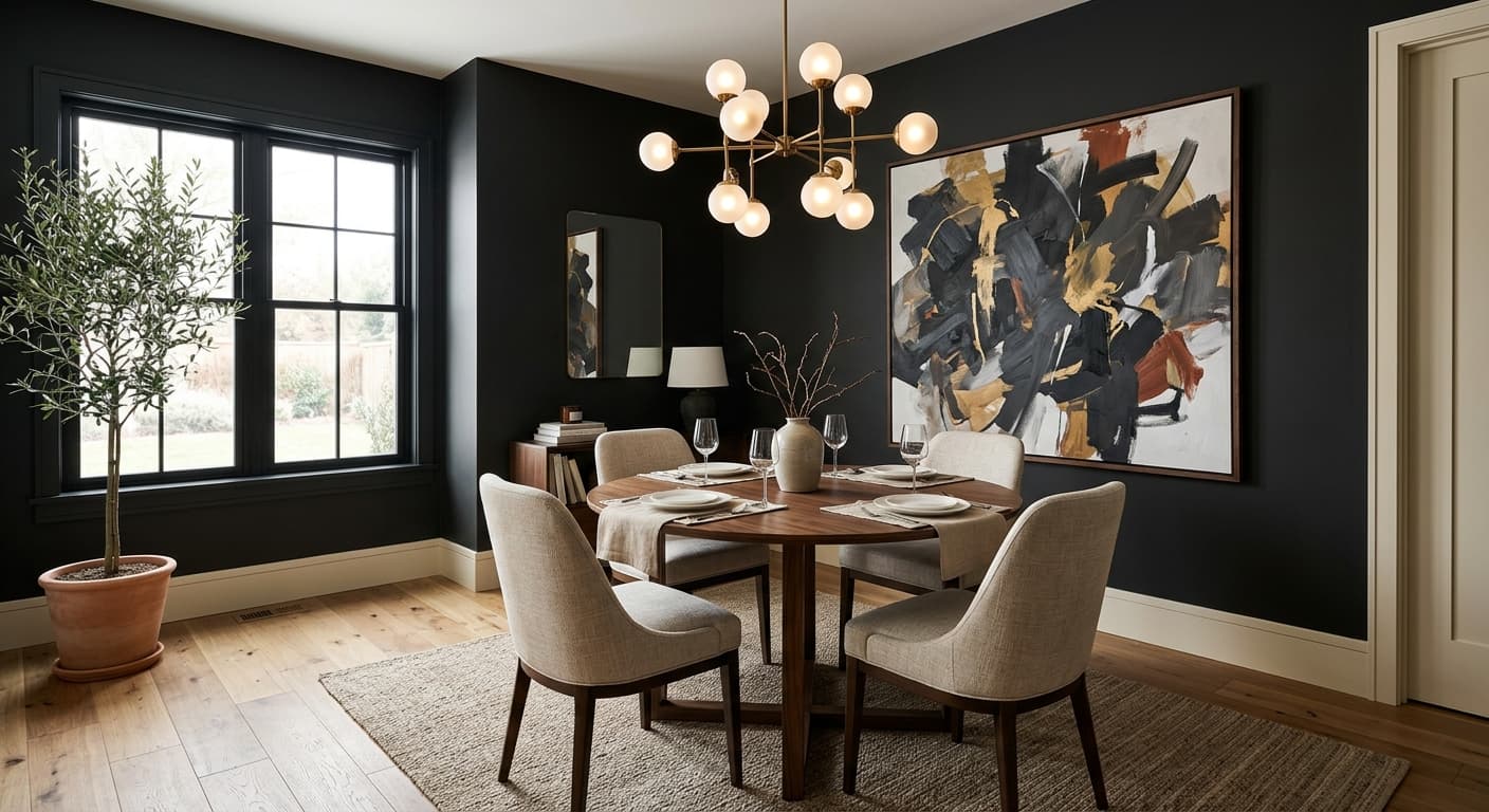
Behr Carbon reads as a near-black charcoal with a quiet cool edge. In a paint chip it can look like flat gray. On a full wall it deepens into something closer to slate, holding more pigment than you expect. This is not a soft greige pretending to be dark. It commits.
Light changes it more than most homeowners anticipate. Under bright midday sun, Carbon lifts slightly and shows a faint blue-gray cast that keeps it from feeling heavy. As evening comes, it collapses toward true charcoal and starts to swallow detail, which is why architectural features painted in this color tend to disappear at night and reappear in daylight. You will notice it photographs darker than it lives.
What makes it distinctive is the balance. Carbon avoids the warm brown-black trap that some dark paints fall into, but it also sidesteps the inky, almost navy feel of cooler charcoals. It sits in the middle. That neutrality is the reason it works across so many styles.
Carbon Undertones
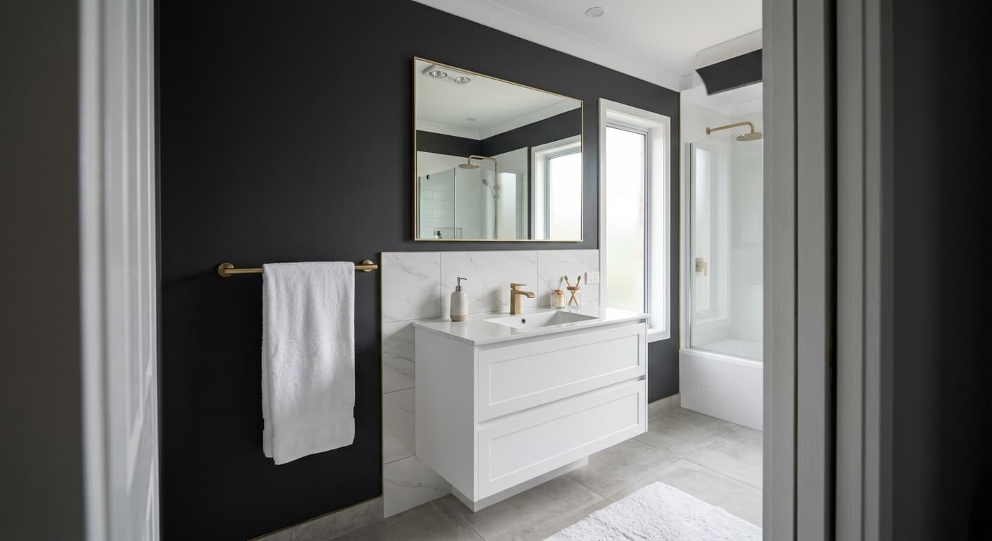
The undertone here leans cool, with a thread of blue running underneath the gray. This matters because cool undertones fight warm ones. Put Carbon next to a creamy yellow-white trim and the two will clash in a way that feels off without your knowing why. Pair it with a crisp cooler white and the whole composition snaps into place.
Watch your fixed elements too. Warm oak floors, brass hardware, and beige stone will all pull against Carbon's cool base. You can still combine them, but you need to do it on purpose, treating the warmth as a deliberate contrast rather than an accident.
Where Carbon Works Best
Carbon performs best in rooms with strong natural light, since the brightness keeps the depth from feeling oppressive. South-facing and west-facing spaces give it room to breathe. In a north-facing room, where light runs cool and flat, Carbon can tip toward gloomy, so reserve it for accent walls or smaller doses unless you genuinely want a cocooning, dim effect.
It shines on cabinetry, built-ins, front doors, and feature walls. In a large open space it can ground the room and make ceilings feel higher by contrast. In a small powder room, going all-in on Carbon creates a dramatic, jewel-box feel that small rooms wear surprisingly well.
What to Pair With Carbon
For trim, reach for a clean white with a slightly cool bias, something like Behr Ultra Pure White or Polar Bear. These keep the contrast sharp and let Carbon's edges stay defined. If you want softer contrast, a mid-gray trim tones down the drama.
For furnishings, lean into texture. Pale linen, light wool, and natural-toned upholstery read beautifully against the dark backdrop. Flooring in a cooler oak or a gray-washed wood keeps the palette consistent. If you crave warmth, add it through brass or aged bronze accents and a few amber-toned objects, used sparingly so they register as accents rather than competition.
Colors That Clash With Carbon
Do not pair Carbon with warm cream or ivory trim, since the temperature mismatch makes both colors look dirty. Skip heavy reliance on it in dim, north-facing rooms with little natural light, where it turns flat and dreary. And resist painting every surface in a small windowless room unless you commit to good artificial lighting, because Carbon will absorb whatever light you give it and ask for more.