Cappuccino Froth
What Cappuccino Froth Actually Looks Like
Cappuccino Froth sits in that comfortable middle ground between beige and gray, which is why people reach for the word greige to describe it. The color reads warm without tipping into yellow. In a bright south-facing room at midday, you will see a soft, milky neutral that feels clean and grounded. The "froth" in the name is fitting. There is a creamy quality here that keeps it from feeling flat or industrial.
The shift across the day is where this color earns its keep. Morning light brings out its softer, slightly pinkish warmth. By late afternoon, as the light cools, it can pull a touch grayer and steadier. Under warm incandescent bulbs at night, expect it to deepen and grow cozier.
Compared to harsher grays, Cappuccino Froth never feels cold or clinical. Compared to traditional beiges, it has enough gray to keep it current. That balance is the whole point.
Cappuccino Froth Undertones
The dominant undertone here is a warm taupe, with a faint pink or red running underneath in certain light. This matters more than people expect. That subtle warmth means it will fight with cool blue-grays placed next to it, and it can amplify pink tones in flooring or stone you already own. Before you commit, hold a sample against your actual fixed elements: countertops, tile, wood floors.
Undertones are the reason two "greige" paints can look nothing alike on the wall. Cappuccino Froth leans warm, so pair it with materials that share that temperature. Cool whites and icy grays will make it look muddy by contrast.
Where Cappuccino Froth Works Best
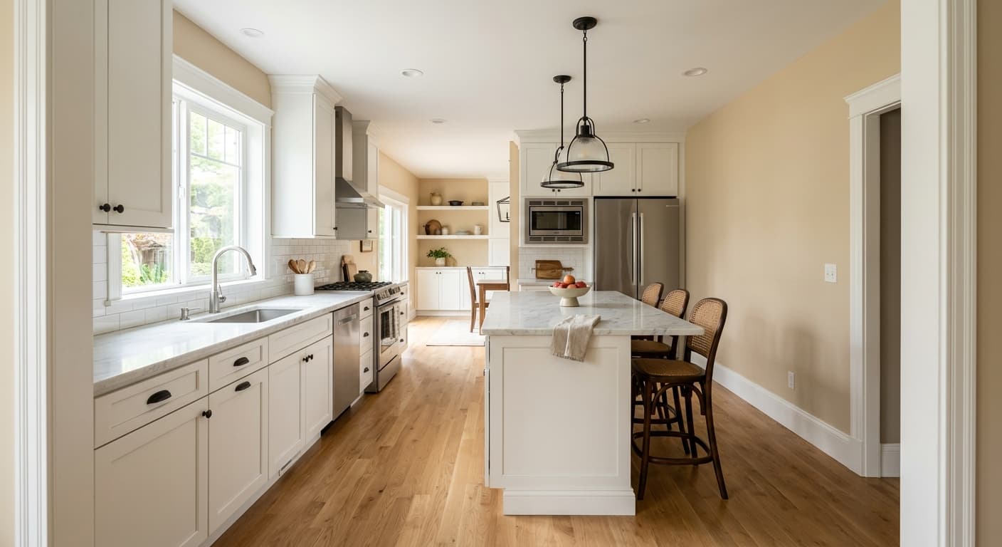
This is a strong choice for north-facing rooms, which receive cooler, indirect light that can drain warmth out of paler colors. The built-in warmth of Cappuccino Froth pushes back against that, keeping a north-facing bedroom or office from feeling gray and gloomy. It also performs well in open-concept spaces where you want one neutral to flow from kitchen to living to hallway without competing.
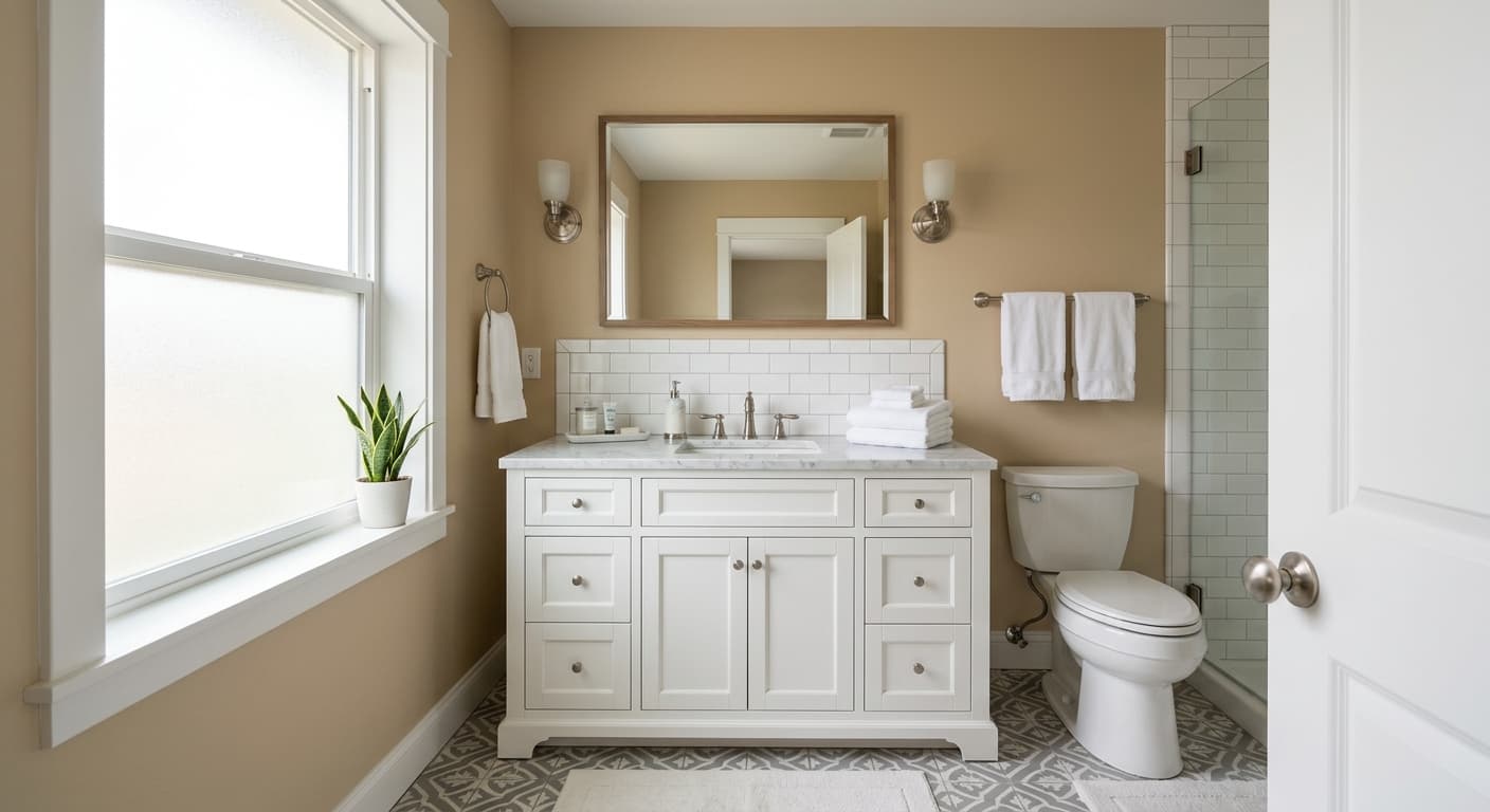
In small rooms, its mid-range lightness keeps things from closing in. In large rooms with good natural light, it provides enough substance that the walls do not wash out to plain off-white. Living rooms, bedrooms, and primary suites are the natural fits. It works in bathrooms too, as long as your tile and fixtures lean warm rather than stark white.
What to Pair With Cappuccino Froth
For trim, a soft warm white does the job. Behr Swiss Coffee or Polar Bear gives you contrast without the jarring brightness of a pure white. Avoid anything labeled "bright white" against these walls. The clash will make both colors look off.
For furnishings, this color loves natural materials. Think oak, walnut, rattan, jute, and linen in oatmeal or caramel tones. Warm wood flooring, from honey oak to medium walnut, sits beautifully here. Black accents in hardware, light fixtures, or window frames add definition and keep the room from feeling too soft. If you want a color partner on an accent wall or in textiles, deep olive, terracotta, and muted navy all hold up well against it.
Colors That Clash With Cappuccino Froth
Keep cool-toned grays and blue-leaning whites away from this color. Placed side by side, they will pull the green and pink out of Cappuccino Froth and make it look dingy. Stark, high-contrast modern schemes also tend to work against its softer nature. And resist the urge to pair it with a competing warm beige on the trim; the two will blur together and the room will lose all definition. Always test a large sample, not a chip, and look at it morning and night before you buy gallons.