Breezeway
What Breezeway Actually Looks Like
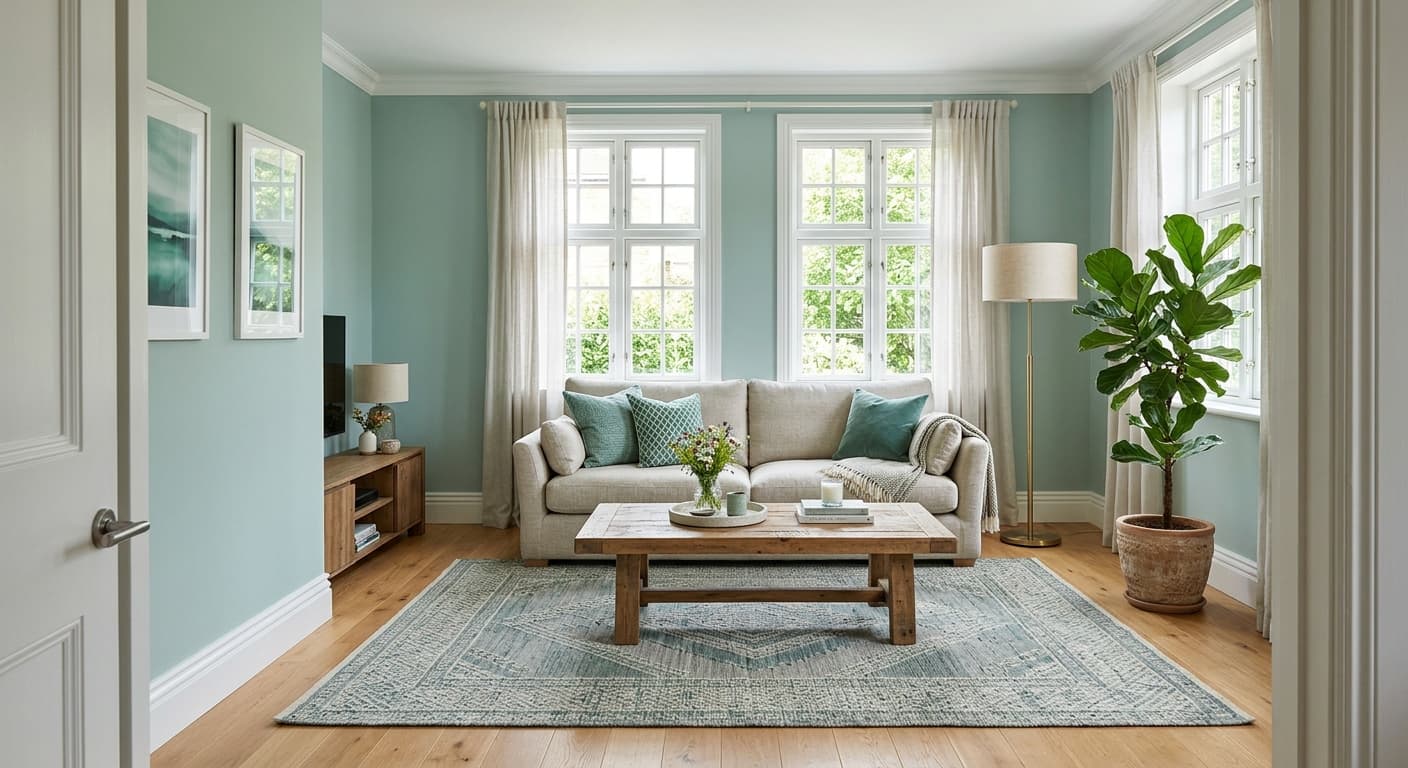
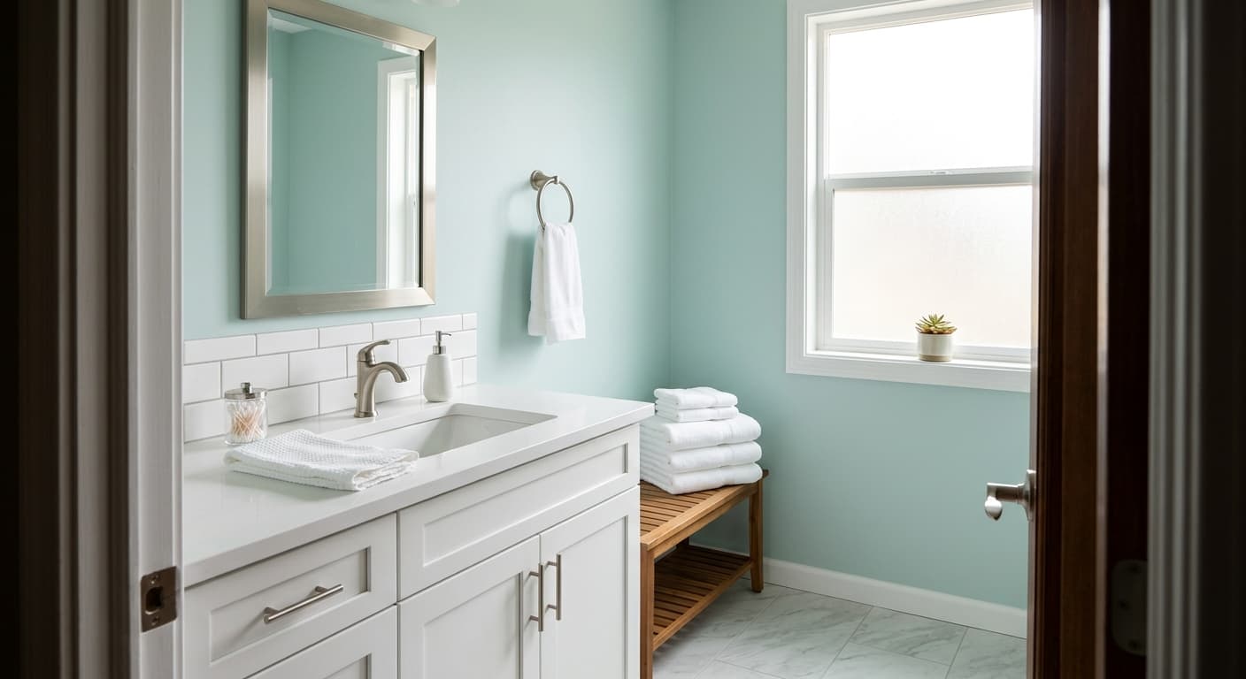
Breezeway sits in that quiet zone between blue and green where neither color fully wins. Think of sea glass that has been washed soft by years of saltwater. It reads as a light, airy aqua in most settings, with enough gray mixed in to keep it from going saccharine or nursery-sweet.
In bright morning light, the blue side steps forward and the color feels crisp and cool. By late afternoon, especially in warmer rooms, you will notice the green edge becoming more obvious. Under cool LED bulbs it can flatten toward gray, which some people love and others find muted. Test it. A swatch on the wall for two days tells you more than any screen ever will.
What makes Breezeway distinctive is its restraint. Many blue-greens shout. This one whispers. It carries enough pigment to feel like a real color choice rather than an off-white, but it never dominates a room or fights with the things you put in it.
Breezeway Undertones
The dominant undertone here is green-leaning aqua with a soft gray base. That gray is the part people miss, and it changes everything. It means Breezeway will not pop against bright white trim the way a pure aqua would. Instead it settles into a more grounded, slightly muted register.
Pay attention to this when you choose neighbors. If your adjacent room has a warm beige or a yellow-based white, Breezeway can look cooler and slightly out of step by contrast. Keep your palette in the same temperature family and the undertone works for you instead of against you.
Where Breezeway Works Best
This color earns its keep in bathrooms, bedrooms, and laundry rooms where you want calm without coldness. North-facing rooms will pull the cool, gray side forward, so go in knowing the result will feel more serene than sunny. South-facing rooms warm it up and bring out the green, which gives the space more life.
Small rooms benefit from its lightness. Because it stays airy, Breezeway opens up a tight powder room or a windowless hallway rather than closing it in. In large open-plan spaces it works too, though you may want a warmer accent somewhere to balance all that cool.
What to Pair With Breezeway
For trim, a soft white with a touch of warmth keeps the whole thing from feeling clinical. Behr Cameo White or Swiss Coffee both work well and let the blue-green stay the focus. If you want more contrast, a crisp bright white sharpens the edges, but expect a cooler, cleaner look overall.
For furnishings, natural materials are your friends. Rattan, light oak, and unbleached linen warm the room and play off the green undertone. Brass hardware adds glow without clashing. On floors, pale to medium wood tones with warmth read best. Gray-washed floors can tip the whole room cold, so use them only if that is the mood you want.
Colors That Clash With Breezeway
Skip the cool grays and stark whites as primary partners unless you genuinely want a chilly, modern feel. They drain the warmth Breezeway needs to feel inviting. Avoid pairing it with strong yellows or terracottas, which fight the cool base and make both colors look muddy. And resist the urge to combine it with too many other soft pastels in one space. Without an anchor color or a grounding neutral, the room can drift into vague and washed-out territory fast.