Boreal
What Boreal Actually Looks Like
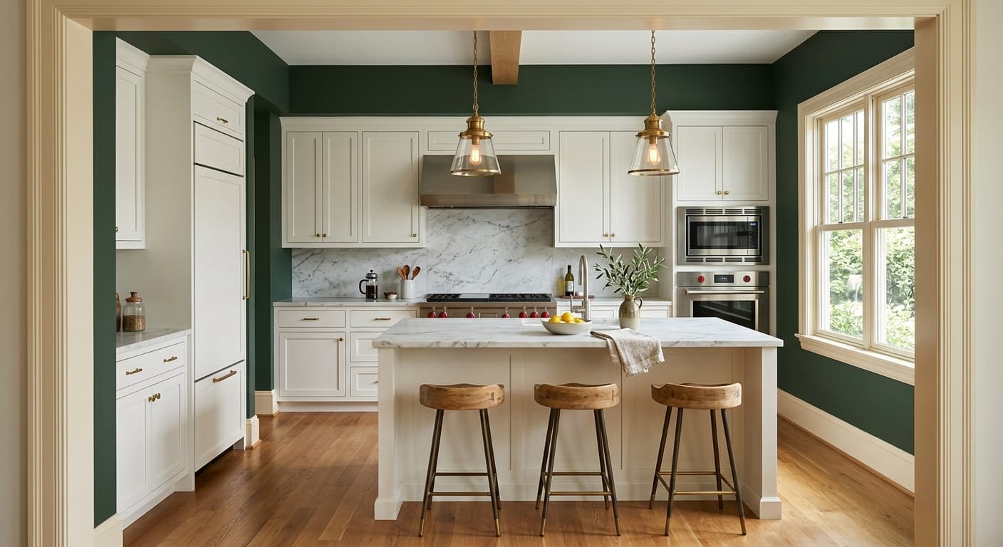
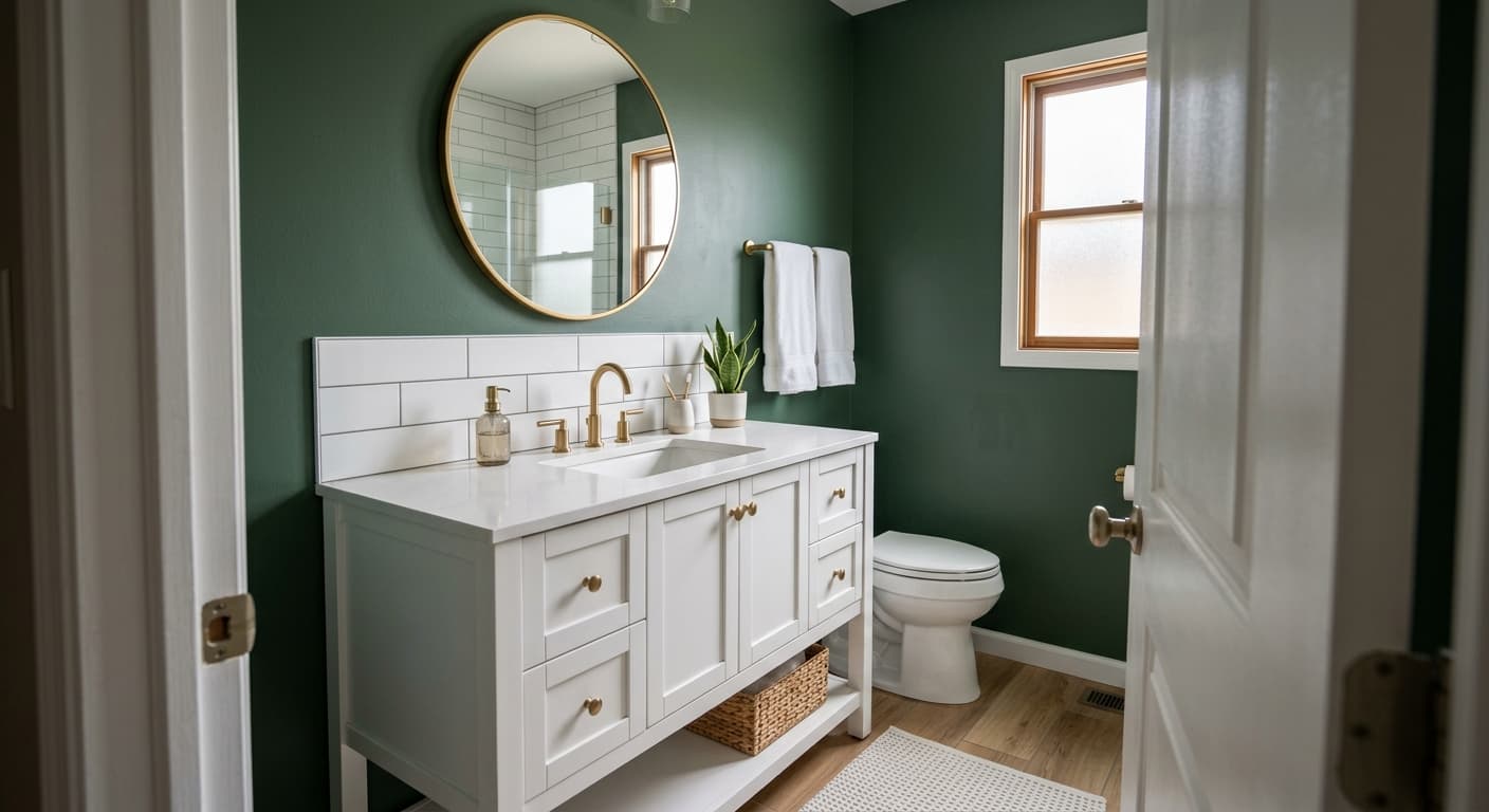
Boreal is a deep forest green with enough gray in it to keep it from reading bright or jewel-toned. Think of the color of pine needles in shade, or moss on the north side of a rock. It sits in that satisfying middle ground where the green is unmistakable but never loud.
In natural daylight, you will notice the green pull forward and the cooler gray notes settle into the background. Morning light makes it feel fresh and alive. By late afternoon, especially in a west-facing room, it warms slightly and starts to look almost olive at the edges where the light hits hardest.
Under artificial light, Boreal can get serious. Warm incandescent or LED bulbs soften it and bring out a richer, more inviting depth. Cooler bulbs push it toward slate and can flatten the green entirely. This is a color that genuinely changes character based on what surrounds it, so test it before you commit.
Boreal Undertones
The dominant undertone here is cool, with a gray-blue quality sitting underneath the green. That matters because it determines what will sit comfortably next to it. Warm, yellow-based greens tend to fight with Boreal and make it look muddy by comparison. Cooler companions let it breathe.
Pay attention to your existing fixed elements. If your flooring or countertops lean warm and golden, Boreal will read as the cool outlier in the room, which can work as a deliberate contrast but will feel off if you were expecting harmony. Hold a sample against the things you cannot easily change first.
Where Boreal Works Best
Boreal thrives in rooms where you want a sense of enclosure and calm. Dining rooms, studies, libraries, and bedrooms all suit it. It wraps a space in a quiet, grounded feeling that lighter colors cannot deliver. In a powder room it turns a small space into something memorable rather than forgettable.
South-facing rooms get the most out of it because the steady warm light keeps the green looking lively all day. North-facing rooms will pull it cooler and darker, which can be moody and intentional or can feel cold if the room is already short on light. In smaller spaces, lean into the depth rather than fighting it. Boreal is happiest when you let it be dark.
What to Pair With Boreal
For trim, a soft warm white like Behr Swiss Coffee or a creamy off-white keeps things crisp without the harsh contrast a stark white would create. If you want a more dramatic, tailored look, paint the trim the same color as the walls for a tonal, enveloping effect. Natural wood trim in walnut or oak also looks excellent against this green.
For furnishings, brass and aged gold hardware bring warmth that flatters the cool undertone. Leather in cognac or tan, natural linen, and woven rattan all complement it well. On flooring, mid-toned warm woods balance the coolness of the walls. Cream or oatmeal rugs keep the space from feeling heavy.
Colors That Clash With Boreal
Skip pairing Boreal with bright cool whites and high-gloss finishes, which make it look harsh and clinical. Avoid placing it next to warm yellow-greens or olive tones, since the undertones clash and both colors lose their appeal. And do not use it in a poorly lit north-facing room without a plan for layered lighting, because without warmth it can tip into gloomy rather than cozy.