Bakery Box
What Bakery Box Actually Looks Like
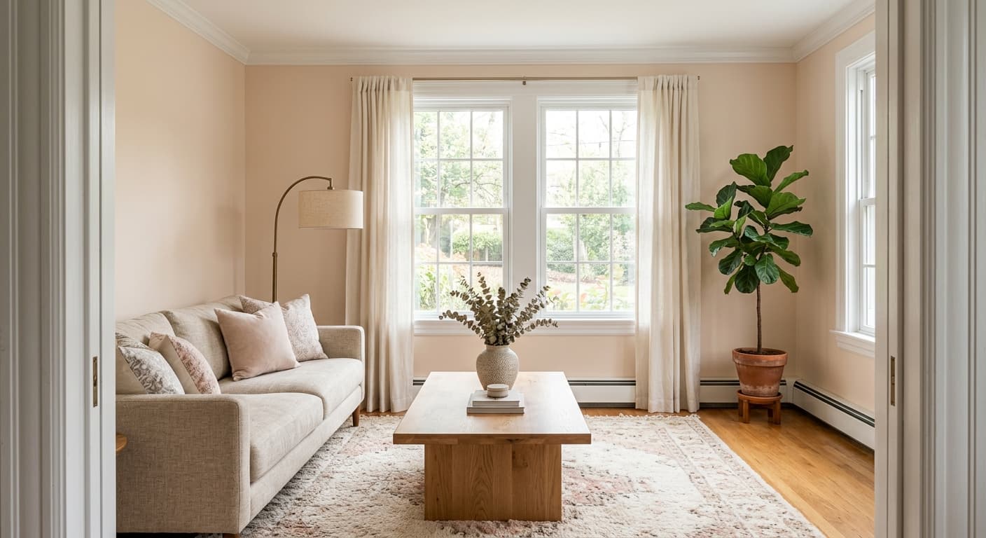
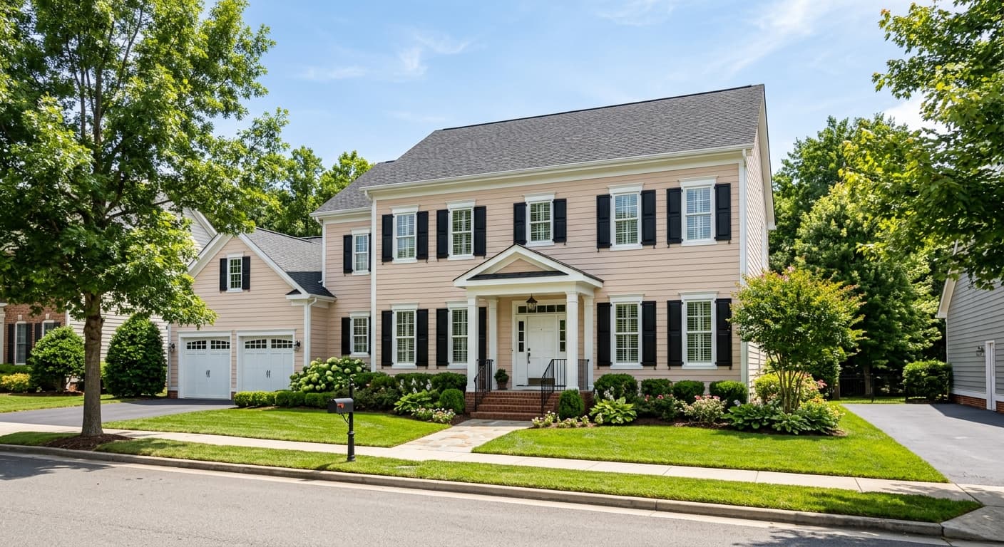
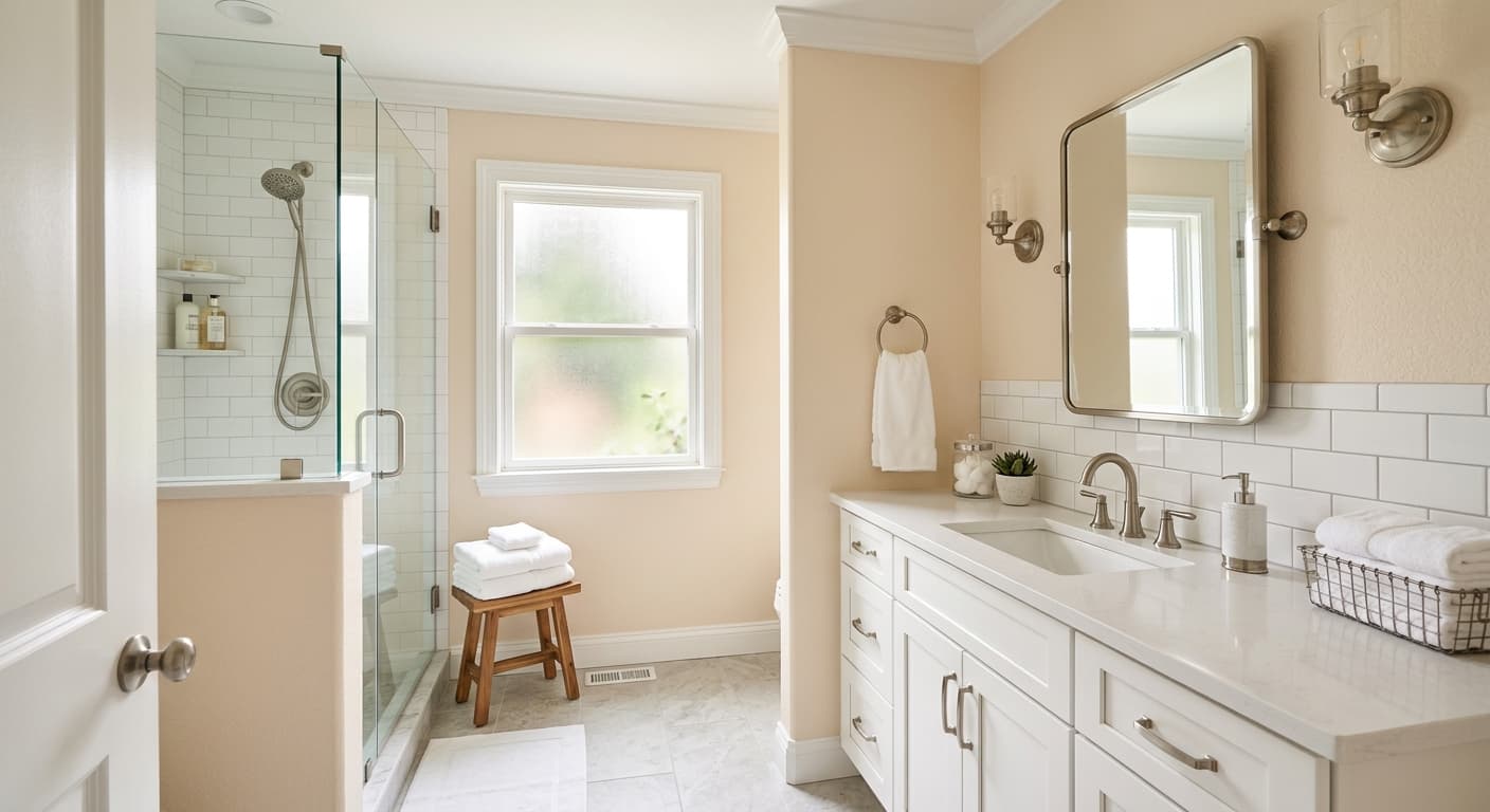
Bakery Box is a soft cream with enough warmth to feel cozy without tipping into yellow. Think of the color of fresh shortbread or the inside of a vanilla cake. It reads as a clean off-white in most rooms, but it carries just enough pigment to keep walls from looking stark or clinical.
The color shifts more than you might expect. In bright morning light it leans pale and airy, almost approaching a true white. By late afternoon, especially in rooms with warm-toned flooring, it picks up a buttery quality that makes the whole space feel softer. Under warm LED bulbs it deepens slightly toward a custard tone.
What makes it useful is its restraint. Many warm creams go too far and end up looking dated or sallow. Bakery Box holds back. It gives you the comfort of a warm neutral without the heaviness, which is why it tends to work across a wide range of styles from traditional to transitional.
Bakery Box Undertones
The dominant undertone here is yellow, with a faint hint of beige underneath that keeps it grounded. This matters because warm undertones interact with everything around them. Place Bakery Box next to a cool gray trim and the cream will look noticeably more yellow by contrast. Pair it with warm wood and natural fibers and it settles into a balanced, harmonious neutral.
Pay attention to your fixed elements before committing. If your countertops, tile, or flooring carry pink or orange undertones, Bakery Box will amplify them. If those elements are cool or gray, the warmth of this color can create a slight clash. Sample it against the things you cannot easily change.
Where Bakery Box Works Best
This color rewards rooms that get warm or moderate light. South-facing and west-facing spaces let it glow without going dingy. It works in kitchens, dining rooms, bedrooms, and entryways where you want a welcoming feeling rather than crisp contrast.
In north-facing rooms, which receive cooler, bluer light, Bakery Box can lose some of its charm and read flatter or grayer than the swatch suggests. You can still use it there, but test it first and consider whether you want that softening effect. In smaller spaces, the high light reflectance helps walls recede and keeps things feeling open.
What to Pair With Bakery Box
For trim, a clean white like Behr Ultra Pure White gives you crisp definition without fighting the warmth. If you want a softer, more blended look, a creamy white trim that is a shade lighter than the walls keeps everything cohesive. Avoid bright cool whites that make the cream look muddy.
For furnishings, Bakery Box loves natural materials. Oak, walnut, rattan, linen, and unbleached cotton all sit comfortably against it. Warm metals such as brass and aged bronze look right at home. For flooring, mid-tone hardwoods and warm stone tile reinforce the inviting quality. If you want contrast, deep greens, terracotta, and navy all pair well as accent colors.
Colors That Clash With Bakery Box
Steer clear of cool grays and blue-based whites as adjacent colors. They drain the warmth out of Bakery Box and leave it looking like a mistake rather than a choice. Stark, high-contrast modern schemes also tend to fight this color. The most common mistake is using it in a poorly lit, north-facing room and then wondering why it looks dull and lifeless. Match the color to the light, not the other way around.